
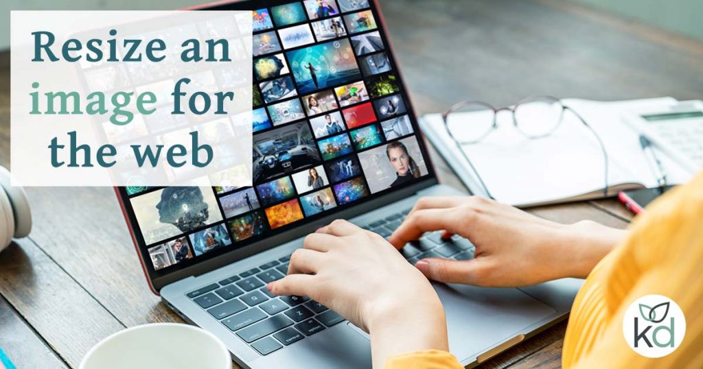
This post explains how to resize an image for the web. Firstly in pixels so the image fits correctly on the web page. Then in kilobytes to reduce the file size without degrading the image too much.
Why do we resize images for the web?
We want to make images look good on screen and to download quickly for website visitors.
Websites with fast-loading images will rank higher on search engines.
Because search engines prefer to send users to websites that provide a good experience.
There are two steps toward a fast-loading image:
- The first step is to resize the image in pixels – and should come first.
That is the width and the height. It needs to be just the right size for its spot on the website.
There are a few oddities in image sizing since the introduction of responsive websites.
An image needs to be the right size for a mobile, a tablet, a desktop and a TV which will discuss later. - The second step is reducing the size of the image in kilobytes – known as compression.
Compressing reduces or combines the colours within an image so it lowers the size in kilobytes. It is possible to do this without losing too much quality.
Carrying out both these tasks – resizing and compressing – is known as optimising an image for the web.
Watch my video which explains why we resize images for the web.
Or visit my blog post – Why resize images for the web?
If need step-by-step instructions on resizing images for the web, see my how-to resize images video at the bottom of the post.
I’ll show you the best practices for resizing an image and how to do it.
The complications with responsive images
Let’s start by looking at responsive images – those that resize to look good on different screen sizes.
We design for mobile first, so I will begin by referencing the mobile version of a website.
On mobile websites, the image usually spans the full width of the screen. Images stack on top of text and users are very used to scrolling quickly down long, mobile-friendly web pages.
For a mobile device, a very good width for an image is 640 pixels. The height can be anything you wish.
But image sizing doesn’t end there. One size does not fit all.
Images on different devices
Let’s think about that same image on an extra large monitor or a TV screen – yes websites are now accessible via your smart TV.
The image might sit in a column to the left of the text.
It might span the width of the screen as it did on the mobile version. We call these hero images.
Imagine how big that image needs to be now?
For a TV, a pixel-perfect image would be 1920 pixels wide or more.
If you’ve already downsized the image to 640 pixels for a mobile, it will look terrible if you try to upscale it to 1920 pixels. You’d be stretching it more than 400%.
Scaling images up doesn’t look good – the pixels stretch and the image appears fuzzy.
Settling to maintain images at 1920 pixels doesn’t solve the problem either. Large images download so slowly, especially on slow internet connections.
To add to the complications: an image should be the exact pixel size for use on the page. Search engines like to have a good idea of the width and height – known as dimensions.
As you can see – there is no standard size and it all gets quite complicated. All we can do is our best.
WordPress plugins for adaptive images
There are a few WordPress plugins that help to serve the correct image size to the device, called adaptive images.
Basically, a small image downloads first – whether that is in size or resolution.
If the screen resolution is large the plugin provides the bigger version. This speeds up the waiting time for the visitor.
This is the solution if you want to use big hero images but are concerned about download time.
Here are two adaptive image plugins that I like:
- Adaptive Images for WordPress by Nevma
Simply sends smaller versions of the images to mobile devices, so a very basic plugin that does the job once settings have been saved after activation. - Shortpixel Adaptive Image by ShortPixel
This plugin is clever. It will start to crop and compress images for different screens as soon as it is activated. Although you can have greater control if required. The ShortPixel documentation is also comprehensive. You can even compare an image before and after compression with their image compression test.
So, what I would do is use these adaptive plugins, but don’t fully rely on them and dump photos onto your WordPress site straight off a camera. Keep your media library clean.
Resize the image first and compress it minimally to bring the KB down. Once you upload it to WordPress, the adaptive image plugin will do the rest.
Let’s start resizing an image for the web.
Resize an image for the web – in pixels
With everything we’ve discussed in mind, choose your image width.
- A photographer would need excellent quality images. To display them at full-screen width on an extra large monitor they’ll need a pretty large image. Size photos to at least 1920 pixels.
- Anyone else, I advise going for 1200 pixels. This is a good balance. People on extra large monitors will see pixelation on full-width images, but it’s a trade-off for a fast-loading image.
For my own website and blog, I use images at a maximum of 1200 pixels wide, most that are on the pages are 800. Here’s why:
- Full-width images are never used on my website. I like to keep everything really speedy.
- My business isn’t particularly visual, people do not need to see my photos at such a high resolution.
- I use separate, exact size images for Open Graph and that doesn’t require anything bigger than 1200.
- From Google Analytics I know people who visit my site are using a handheld device or a laptop. Useful information.
I leave it to your discretion.
Free image editing software
There are plenty of free tools available to you online as well as image editing programmes that can be downloaded.
For photos stick to JPEG file format, and that is what we will cover here.
For vectors go for PNG or SVG – and that is for a future tutorial.
GIMP image editing software
‘GIMP’ (the GNU Image Manipulation Program) is an image editor that is completely free.
Download the current stable version of GIMP from the website.
GIMP provides a tutorial on changing the size (dimensions) of an image (scale).
Online image editors
A quick search for ‘resize and compress image online’ will provide a host of ways to upload, resize, and compress then download an image.
The best I found was Easy Image Resize, a free website that both resizes and compresses a file.
There is some guesswork, as you’re required to fill out the KB output. For an image of 1200 pixels wide, try 150KB. You get to see how it looks before you download it. Increase or decrease the KB as you wish.
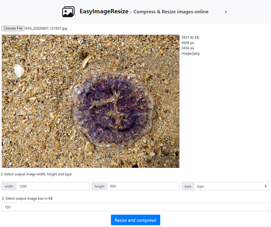
The output image format will be JPG.
Adobe Express is a free image resizing tool – use it through the browser on a desktop or as an app on mobile. It resizes an image correctly for social media and you can choose the custom size for a website.
If you resize the image on your computer, then there are loads more online compression options :
- Optimizilla
- TinyPNG (also for JPEG)
- Compressor.io (compression only)
Lossy and Lossless
There seems to be a trend regarding the amount of compression taken out on the image known as Lossy and Lossless. I recommend LOSSY if you are to add your image to a website. Here are explanations for the two options:
Lossy: Huge savings, no visible quality loss.
Perfect for web images.
Lossless: Small file size reduction, no loss in quality.
Recommended for print and high-res photographs.
If you are editing and optimising images frequently, I recommend downloading GIMP for free or buying Adobe Photoshop. Watch my how-to video at the bottom of this post.
Resizing an image in KBs – compression
Compressing is very different from resizing. All images should be compressed before upload, even if you are using an adaptive image plugin.
Compression lowers the file size of the image by reducing pixels, so it downloads faster.
During the compression, try not to compromise the quality of the image too much.
Try to achieve a balance between the image looking good and downloading quickly.
Images can be compressed using the GIMP software too.
GIMP tutorial on changing the size (FileSize) of a Jpeg.
How to resize images in GIMP and Adobe Photoshop
A step-by-step video showing you how to resize and compress JPEG images in GIMP and Adobe Photoshop.