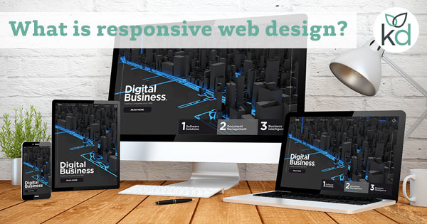
Responsive web design (RWD) is a design system that provides an audience with the easiest reading and navigational experience on any device or computer screen.
When a website is responsive there is no need to resize a page or pan across to see more information.
Responsive design is different from mobile web design – a mobile design is usually a separate design for mobile use only and might be hosted on a subdomain for example – mobile.kaydee.net.
In responsive web design, the same website is viewed on both mobile and desktop, but the elements adjust to fit the screen they are viewed on.
Most websites should be designed predominantly with mobile in mind – this is often the most common device for a website to be viewed in (depending on the industry, but let’s not go down that road).
After a website is well designed for mobile, expand the design to consider larger screens.
Responsive devices
There are 4 screen sizes that web designers talk about:
- Mobile phone.
- Handheld tablet.
- Desktop i.e. a computer monitor.
- Television screen (TV).
The term ‘mobile device’ might mean a mobile phone or a handheld tablet, such as an iPad or Galaxy Tab.
There are also complexities because there are crossovers in the size of devices, especially when taking into account that a mobile device can display a website in portrait or landscape view.
There’s more room for the width of a website in landscape view as opposed to portrait view.
It is also possible to have a very small smartphone – think of the older iPhone screens. So all of this needs to be taken into account when designing a responsive website.
Common responsive web design screen sizes
Common minimum widths for responsive web design are:
- 480px – very small mobile devices.
- 576px – for small mobile devices.
- 768px – for medium mobile devices.
- 992px – for desktops, commonly laptops.
- 1200px – for larger desktop monitors.
Having listed the common screen sizes, I find that different website designs need adjustments at very different screen widths. Let the design of the site govern the breakpoints.
Responsive website designers tweak the website design when the screen gets to a certain ‘breakpoints’. The breakpoints are measured in pixels or screen sizes.
On a responsive website, often the following elements adjust to the screen:
- Navigation.
- Text blocks.
- Heading size and position.
- Paragraph size.
- Images.
Responsive navigation
On a mobile device the navigation (the menu) no longer fits on the screen in full size, it will usually collapse into a condensed version.
You’ll frequently see an icon called the ‘burger’ which hides the menu on small screens until it is needed. Once clicked the menu opens up and the user can navigate around the site.
This allows the user to view the page content instead of continuously needing to move down the page to get past a big block of navigational links.
Text blocks
Text blocks on a small mobile device would come one after the other – they would sit below each other so people can scroll through the text.
On a larger monitor text blocks can sit next to each other in columns and that is a much easier way to view the text on a larger screen. It gives more options to the visitor of the site.
Responsive headings
Page headings look very different on mobile compare to desktop and will need to fit into their parent text blocks. On a mobile, a heading might look better centred and slightly smaller.
On a desktop, larger text can be used as the designer has more screen to play with.
Responsive images
Images should always be organised to resize dependent on the screen size. This is why there is always slight confusion when it comes to the physical size and the file size of web images.
Bootstrap and responsive web design
If you are getting started in responsive web design or app design check out Bootstrap – an opensource toolkit for responsive web design.