WordPress blocks are the latest way to help website owners edit their WordPress page.
They enable us to arrange the page into columns or add tables – neither of which was possible in the classic WordPress editor.
Take a look at my in depth post – How to use the WordPress block editor.
An end to the need for extra plugins
The new block editor puts an end to the need for extra layout plugins used in the past – such as the Divi Builder or the Fusion Builder. These are code heavy – a negative signal in search engine optimisation.
WordPress blocks can be moved and positioned on the page simply by dragging. A more user-friendly way of editing in WordPress. If you know how.
New features
The WordPress block editor – also known as the Gutenberg editor – is quite different from the classic WordPress editor. It takes a little getting used to if you are an old hand at WordPress editing, but I encourage you to take the leap. It is fantastic.
Two features of the new WordPress editor that I love are:
- The freedom to put pages into columns, which was impossible without an external editor before. As we know, extra plugins slow the website down, so reducing plugin weight is fine by me.
- The ability to move a block above or below adjacent blocks at the click of a button. No more copy and paste.
Visit How to use the WordPress block editor for a tutorial on its uses.
New block types in WordPress
What is really exciting is that website owners can now add columns and tables – which were a real pain before.
Plus there are blocks for things like LATEST POSTS, for which you used to need short-code.
Columns in WordPress blocks
To add a column go to the + Plus icon, as highlighted at the beginning of this post. Choose columns and a new block will appear on your page. Within it there is a choice of column layout – columns can be added as 50% of the page, or as thirds of the page.
What you can then do is add blocks of text or images inside the columns.
On a mobile the columns will stack nicely, and on a desktop computer they will spread across the screen.
Tables in WordPress blocks
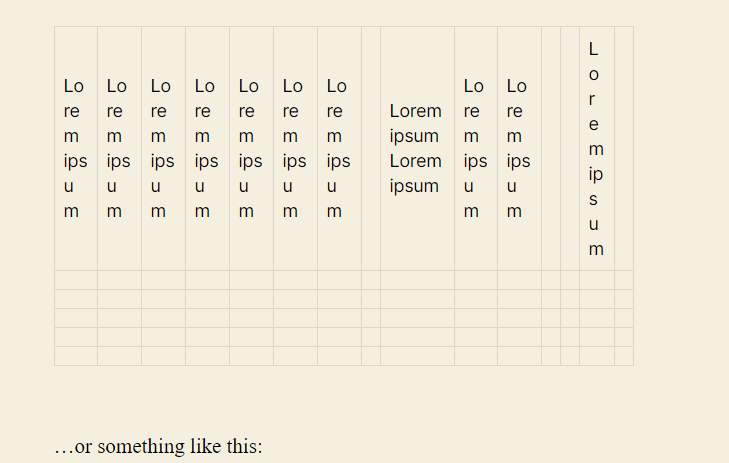
Do be careful with tables, as they are not always mobile friendly. The more complicated the information within the table the less good it will look on a small screen. You can see below an example of a table that is too full, and looks really bad – even on a big screen. So be careful with tables.

To add a table go to the + Plus icon, as highlighted at the beginning of this post. You can choose the number of columns and rows, and as I say, keep this to a minimum if you don’t know what you are doing.
WordPress block editor- bugs
I have a found a couple of bugs in the WordPress block editor. I’ve also found nuances which are slightly confusing, but I have been able to get around.
- The button link. Please see my post ‘Buttons in the block editor‘ for more information.
- Groups of blocks are hard to grasp.
- Adults of nested blocks are difficult to select (this has been fixed by WordPress as of July 2020).
- Items can’t be dragged to the bottom of a column. There is a need to reorganise.
- It takes a few clicks to select a column, and adjust its width.
Have you found these gremlins too?